Jonah loved designing. He did not love playing tech support.
He’d invested in a robust client portal system - timelines, forms, threaded messages, the works. In theory, it was perfect. In practice:
- Clients forgot their passwords.
- Nobody could find the right file version.
- Feedback arrived via email, text, DM, and sticky notes on screenshots.
One afternoon, after yet another “Can you resend the link?” message, he tried something different. For his newest client, a small bakery, he skipped the portal and opened a LunaBoard instead.
He named it: “Honeycomb Bakery - Brand Storyboard.”
One Board, One Link, Zero Logins
Jonah started simple.
He invited the bakery owner, Lena, via email and told her: “Everything lives here. You won’t need another password.”
On the board, he set up five clear sections:
- Discovery & Vibes
- Moodboard
- Logo Explorations
- Applications (menus, packaging, etc.)
- Final Assets & Next Steps
He pinned a big text note at the top: “If you’re ever not sure where something is, scroll up and start here.”
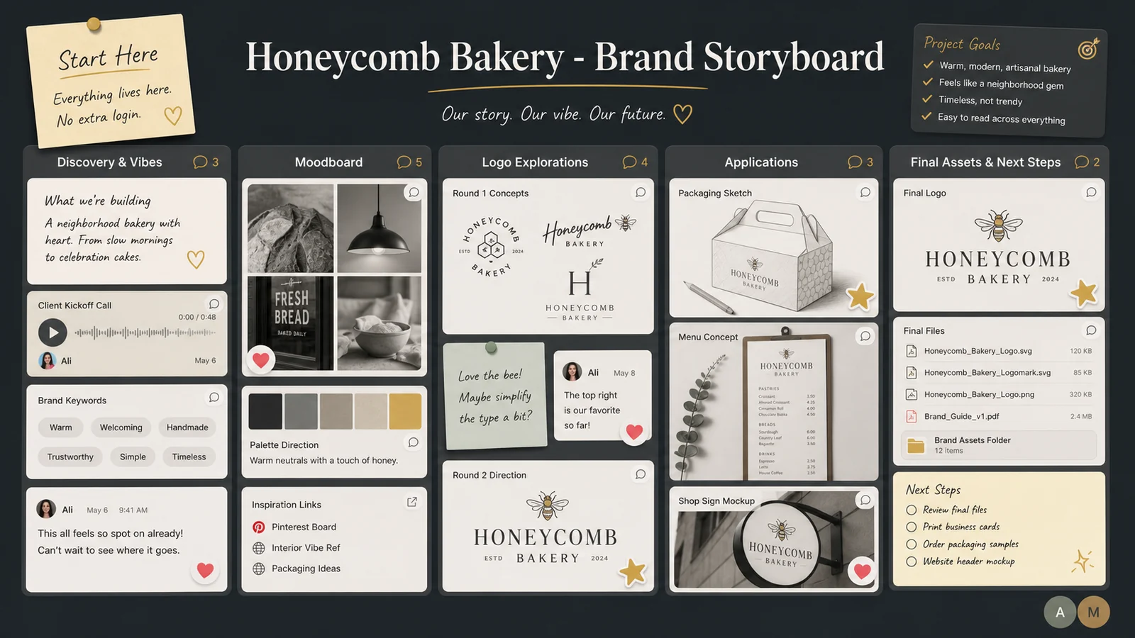
Instead of Lena digging through folders, she bookmarked one link.
Capturing Vibes Without a 10-Page Questionnaire
Under “Discovery & Vibes,” he dropped:
- Photos Lena had texted him of bakeries she loved
- Screenshots from her existing Instagram
- A quick collage of words they’d come up with on a call: “warm, not rustic,” “playful, not childish,” “golden, not neon yellow”
He added a small text block titled “You can add here too!” and invited her to drag in anything that felt right:
- Packaging from chocolate bars she liked
- A picture of the tiles in her new shop
- A video of the way sunlight hit her window at 8 a.m.
Instead of asking her to fill out a form, he watched what she added and how.
Moodboard & Concepts in One Place (With Reactions That Actually Help)
For the moodboard, Jonah created three mini-clusters:
- Option A: Soft & Whimsical
- Option B: Clean & Modern
- Option C: Bold & Cozy
Each cluster had:
- Color swatches
- Typography examples
- Reference logos (from other industries, never competitors)
- Lifestyle imagery
He told Lena: “Don’t overthink it. Spend five minutes reacting - ❤️ for ‘love,’ 🙂 for ‘okay,’ 🚫 for ‘no thanks.’ Then leave 1 - 2 comments about what you notice.”
Within a day:
- Option A had a lot of ❤️ and comments like “This feels like Saturday morning.”
- Option C had mixed reactions: “Love the coziness, not the darker colors.”
- Option B was mostly 🙂 - fine, but not exciting.
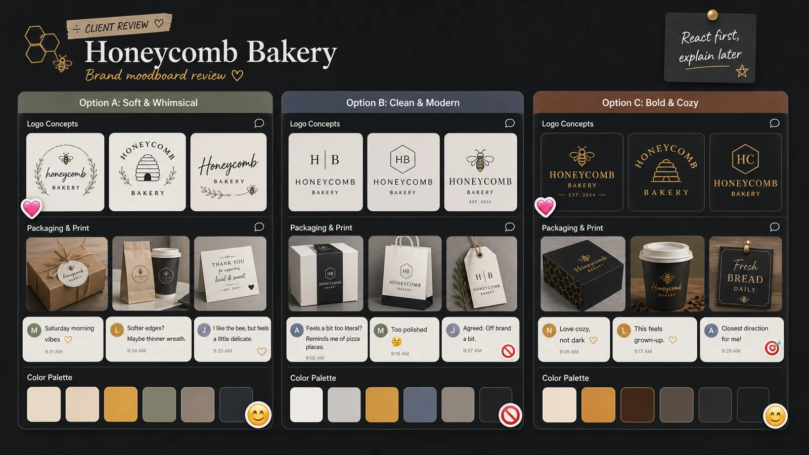
Now he didn’t have to guess. The board told him where to go.
Using Comments and Voice Notes for Clearer Feedback
When it came time to share first logo concepts, Jonah added them under “Logo Explorations” with clear labels:
- Concept 1 - “Honey Halo”
- Concept 2 - “Corner Oven”
- Concept 3 - “Warm Pocket”
Instead of sending a PDF, he asked Lena to:
- Leave comments directly under each logo about what she liked/didn’t like
- Add a 🎯 reaction on any version that felt closest to “right direction”
- Record a voice note if typing felt overwhelming
Lena ended up leaving a 40-second voice note under Concept 2: “I love how this one feels grown-up, but I keep missing the ‘warm hug’ feeling we talked about. Maybe softer edges? Or something with the bee imagery we liked?”
Hearing her tone helped more than three paragraphs of overthinking.
Keeping Rounds Organized Without Fancy Status Dashboards
Jonah set up a simple system:
- Each round got a little heading: “Round 1 Logos,” “Round 2 Refinements,” etc.
- When a concept moved forward, he added a ✅ sticker.
- When something was officially off the table, he marked it with ❌ and a note: “Documenting this so we don’t circle back accidentally.”
In “Applications,” he showed:
- Menu mockups
- Box designs
- Window signage ideas
Each had variations side by side, with the same reaction/feedback pattern. No one had to remember file names; they just pointed and reacted.
Delivering Finals in a Way Clients Actually Use
Under “Final Assets & Next Steps,” Jonah placed:
- A clear text list of what was included: “Logo files (color/mono), social icons, brand colors, type suggestions.”
- Cloud storage links with labels like “Print Files,” “Web Files,” “Social-Ready.”
- A one-page “Brand Snapshot” image he created and pinned to the board.
He recorded a final 2-minute walkthrough as a voice note on the board: “Here’s where you’ll find everything, plus how I’d use these in your next few months - signage, Instagram, packaging.”
Lena later told him she played it back every time she opened Canva to make a new graphic.
Frequently Asked Questions
Is LunaBoard a project management tool?
Not in the traditional sense. It’s a collaborative visual canvas. For many freelance designers and small studios, that’s exactly enough: one space where ideas, drafts, feedback, and final assets live together, without forcing clients into heavy software.
How do I keep boards from getting messy across multiple projects?
Create a simple template board for your process (Discovery, Moodboard, Concepts, Applications, Finals). Duplicate it for each client and keep one board per project. Archive old exploration clusters into a “Past Rounds” area once decisions are made.
What if my clients aren’t techy?
A single shared link, clear section labels, and on-board instructions go a long way. Most clients understand “click, look, react, comment” quickly - especially when they don’t have to remember a login or navigate a complex UI.
Can LunaBoard replace email entirely?
Probably not. You’ll still send contracts and quick check-ins via email. But you can make the rule that all visual feedback and decisions happen on the board, which dramatically cuts confusion.
Conclusion & Gentle Next Step
Jonah still has a client portal subscription. He almost never uses it. His LunaBoard projects feel lighter for him and clearer for clients - and no one has asked “where’s the latest file?” in months.
If you’re a designer drowning in feedback channels, consider giving each project a single visual home. Build your own client board template in LunaBoard and let your next project unfold where you all can see it.